PROBLEM: I want to show how long it takes to get to places by music. When i walk to class and drive to places i listen to my ipod so for the past few weeks i have been recording the music i listen to and how long it takes me to get to places.
WHAT I DID and WHAT I WANNA DO-For my idea i recorded how many songs i listened to when i went different places for two weeks. I discovered that i need to cut down on my shower time because it takes me the same amount of time to walk from my apartment to the art building. Which ranges from 12 to 15 minutes. But there are some factors that change the number of songs listened to on these trips. For example the length of the songs i listen to, and depending on the beat of the song i either walk faster or slower. So i would like to show what songs i listened to and the length of each them and what genre they are, and on each day how long it took me to walk to these places. I wanted to show the number of songs and places with an actual map. The song lengths i was going to list below the map, and on the side i want to list the genres of the songs, so you can look and see, "oh she got to class faster this day because she listened to faster pace music."

In this map the person maps their whole day out in a lateral map, and the block sizes of the places correspond to how long they were at each place. I like this one because it shows visually where they were and for how long. i want to use something like this for my map; using space as a measurement for time. I want to have a key, like on a map where they have a line to say this length is equal to one mile. For mine a line length equals one song with is equal to 3 min.
This map maps out certain points of stops and the tracks they took. I want to show this on my map as well, i want to use lines to show the tracks i have taken while listening to my music.
For this one they show music listed on their ipod and the bigger sized boxes is the music that the person listens to most. I like this map because it tells a story and shows what the persons interests are and what kind of music they listen to tells a lot about the person. I want to also have a list of the music that i listened too but i am unsure if i want to use a method like this one or just make a list and write next to it how often or how many songs i listened to in the past week while i was recording my data.
This is like the first mapping one, i like this one because it shows it in a 3d version and uses street sign like listing of the information. i like this idea, especially for my concept because it shows travel.
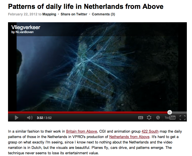
This map is like the second one because it shows lines of travel of airplanes out of the Netherlands.
This shows a list of friends and the proximity of yellow circles to the middle dot shows how close the relationships are, the size of the dot shows the weight of the person, and the lines show the relationships between all the friends. I like this because it shows how everything is connected, this one i like to use the concept of the lines and the connections made between the music and the time.
This one is connected to the ipod music map, but instead of a big box this one shows the information in a bar graph, so i may use a bar graph or just have the box with the separations in the background, and put the actual map with the lines over top in the foreground.


I'd really take a look at some music info graphics for some influence on how you can incorporate your music theme into your piece.
ReplyDeleteI really like this idea, but try not to make it complicated. I know in the first part of the project, your idea was getting lost by what all was being talked about, so I just say to be careful in what information you choose to use and that it's not an overwhelming amount. Try to keep it simpler and I think this could be a really successful project!
ReplyDeleteI like your idea and how you are comparing different activities or tasks so we can see how long you spend on certain tasks as compared to other tasks. Don't add too much information though. Keep it simple and organized so it's not difficult for the reader to understand.
ReplyDeleteThis is a great idea. I like that you are going to add the genre of the music but that it very important because like you said, depending on the genre, the faster or slower you are going to walk. Im very excited to see how this turns out!
ReplyDeleteI like your idea, but I agree with Erin in that it could get too complicated. I think the simpler, the better with this idea. It could get cluttered with too much wording if you include the names of all the songs and the artist and the genre. Maybe just stating the genre would work. People know which genres are faster or slower paced, or have more of a hard beat. So I don't think anything would be lost by omitting the song title and artist.
ReplyDeleteI think it might be good to consider making a physical map for at least part of your infographic, since you're talking about distance.
ReplyDeleteI like this idea. The only thing I see being a problem is that songs vary in length, so if you were walking to class and something like "Stairway to Heaven" came on, for example, that one song would take up 8 minutes and 2 second of your walk. Of course, this depends on what kind of music you listen to. Maybe try rounding the number to about 3 minutes and 50 seconds since I think that's an average song length.
ReplyDelete-Jess Lukasavage
I agree with people about simpllifying the idea. I'm sure you listen to alot of different artists and songs so including them all would be overwhelming. Maybe you could just include what genre you were listening to, how many minutes you listened to it, and how long it took you to get to class. I agree with Jeis about song lengths being factored in.
ReplyDeleteThis is such a great idea. I love the opportunities you have to showcase this & how great it can be. Be sure to include genres and artists, and showcase the information in as many ways as possible while still being clear.
ReplyDeleteI really like your second graph. I think if you look towards that for inspiration you will be able to execute it well.
ReplyDeleteI think that this is a good idea but i feel like there is so much data and it might get confusing try to narrow it down and focus and what you think is the most important and what you are trying to show.
ReplyDelete